VANCOUVER AQUARIUM WEBSITE REDESIGN
<>index4.html>...
<!DOCTYPE html>
<html lang="en">
<head>
<meta charset="UTF-8">
<meta name="viewport" content="width=device-width, initial-scale=1.0">
<title>Vancouver Aquarium</title>
<link rel="stylesheet" href="style.css">
<style>
.logo {
display: flex;
align-items: center;
gap: 25px;
color: white;
font-weight: bold;
}
.logo img {
height: 80px;
width: auto;
border-radius: 10px;
}
.navbar {
display: flex;
justify-content: space-between;
align-items: center;
background-color: #013477;
padding: 25px 30px;
border-radius: 15px;
}
.nav-links {
display: flex;
gap: 40px;
list-style: none;
}
.nav-links a {
display: flex;
text-decoration: none;
text-align: center;
color: whitesmoke;
font-weight: bold;
font-family: 'Times New Roman', Times, serif;
font-size: 24px;
padding-right: 50px;
}
.nav-links a:hover {
color: #a1f1ff;
}
body {
font-family:'Franklin Gothic Medium', 'Arial Narrow', Arial, sans-serif;
text-align: center;
background-color: #0077b6;
color:aliceblue;
}
.header {
color: white;
padding: 20px;
}
h1 {
font-family: 'Times New Roman', Times, serif;
font-size: 50px;
}
h2 {
font-family: 'Times New Roman', Times, serif;
font-size: 32px;
}
h3 {
font-family: 'Times New Roman', Times, serif;
font-size: 24px;
}
h4 {
font-family: 'Times New Roman', Times, serif;
font-size: 20px;
}
p {
font-family: 'Times New Roman', Times, serif;
font-size: 20px;
}
.cards {
display: flex;
justify-content: center;
gap: 20px;
padding: 40px;
}
.card {
background-color: rgb(252, 252, 255);
color: black;
padding: 20px;
width: 350px;
height: auto;
border-radius: 15px;
display: flex;
flex-direction: column;
gap: 10px;
}
.card img {
width: 100%;
height: 200px;
object-fit: cover;
border-radius: 10px;
}
.card:hover {
transition: 0.2s;
}
.hero {
background-color:#8fe0ee;
color: black;
padding: 60px 20px;
position: relative;
border-radius: 15px;
}
.hero img {
width: 100%;
height: 900px;
object-fit: cover;
border-radius: 10px;
}
.hero-text {
position: absolute;
top: 50%;
left: 50%;
transform: translate(-50%, -50%);
color: white;
background-color: rgba(0, 0, 0, 0.541);
padding: 20px;
border-radius: 10px;
}
.btn {
display: inline-block;
margin-top: 15px;
background-color: #0077b6;
color: white;
padding: 10px 20px;
border: 8px;
border-radius: 5px;
margin-top: auto;
}
.btn:hover {
background-color: #113668;
}
footer {
margin-top: 35px;
padding: 15px;
background-color: #013477;
}
</style>
</head>
<body>
<header>
<h1>Vancouver Aquarium</h1>
</header>
<nav class="navbar">
<div class="logo">
<img src="logo.jpeg" alt="logo">
</div>
<ul class="nav-links">
<li><a href="index4.html">Home</a></li>
<li><a href="exhibitpage.html">Exhibits & Experiences</a></li>
<li><a href="ticketpage.html">Tickets & Memberships</a></li>
</ul>
</nav>
<div class="container">
<section class="hero">
<img src="Ocean.jpeg" alt="Ocean">
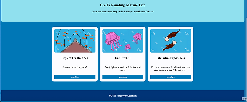
<h2>See Fascinating Marine Life</h2>
<p>Learn and cherish the deep sea in the largest aquarium in Canada!</p>
</section>
<section class="cards">
<div class="card">
<img src="tanktunnel.jpeg" alt="tanktunnel">
<h3>Explore The Deep Sea</h3>
<p>Discover something new!</p>
<a href="exhibitpage.html" class="btn">Learn More</a>
</div>
<div class="card">
<img src="jellyfish.jpeg" alt="jellyfish">
<h3>Our Exhibits</h3>
<p>See jellyfish, sea otters, dolphins, and more!</p>
<a href="exhibitpage.html" class="btn">Learn More</a>
</div>
<div class="card">
<img src="seaotter.jpeg" alt="seaotter">
<h3>Interactive Experiences</h3>
<p>Wet labs, encounters & behind-the-scenes, deep ocean explorer VR, and more!</p>
<a href="exhibitpage.html" class="btn">Learn More</a>
</div>
</section>
<footer>
<p>© 2026 Vancouver Aquarium</p>
</footer>
</body>
</div>
</html>
<>exhibitpage.html>...
<!DOCTYPE html>
<html lang="en">
<head>
<meta charset="UTF-8">
<meta name="viewport" content="width=device-width, initial-scale=1.0">
<title>Vancouver Aquarium</title>
<link rel="stylesheet" href="style.css">
<style>
.logo {
display: flex;
align-items: center;
gap: 25px;
color: white;
font-weight: bold;
}
.logo img {
height: 80px;
width: auto;
border-radius: 10px;
}
.navbar {
display: flex;
justify-content: space-between;
align-items: center;
background-color: #013477;
padding: 25px 30px;
border-radius: 15px;
}
.nav-links {
display: flex;
gap: 40px;
list-style: none;
}
.nav-links a {
display: flex;
text-decoration: none;
text-align: center;
color: whitesmoke;
font-weight: bold;
font-family: 'Times New Roman', Times, serif;
font-size: 24px;
padding-right: 50px;
}
.nav-links a:hover {
color: #a1f1ff;
}
.feature {
display: flex;
justify-content: center;
gap: 150px;
padding: 60px;
}
.feature img {
width: 450px;
height: auto;
border-radius: 10px;
}
.reverse {
flex-direction: row-reverse;
}
.section {
background-color:#c9f7ff;
border-radius: 15px;
}
.hero {
background-color:#8fe0ee;
color: black;
padding: 60px 20px;
position: relative;
border-radius: 15px;
margin-top: 25px;
}
.hero img {
width: 100%;
height: 900px;
object-fit: cover;
border-radius: 10px;
}
.hero-text {
position: absolute;
top: 50%;
left: 50%;
transform: translate(-50%, -50%);
color: white;
background-color: rgba(0, 0, 0, 0.541);
padding: 20px;
border-radius: 10px;
}
body {
font-family:'Franklin Gothic Medium', 'Arial Narrow', Arial, sans-serif;
text-align: center;
background-color: #0077b6;
color:aliceblue;
}
.header {
color: white;
padding: 20px;
}
h1 {
font-family: 'Times New Roman', Times, serif;
font-size: 50px;
}
h2 {
font-family: 'Times New Roman', Times, serif;
font-size: 32px;
}
h3 {
font-family: 'Times New Roman', Times, serif;
font-size: 24px;
}
h4 {
font-family: 'Times New Roman', Times, serif;
font-size: 20px;
}
p {
font-family: 'Times New Roman', Times, serif;
font-size: 20px;
}
footer {
margin-top: 35px;
padding: 15px;
background-color: #013477;
}
.info-list {
margin: 15px auto;
margin-bottom: 20px;
width: 300px;
text-align: center;
}
ol info-list li::before {
color: #013477;
font-size: 70px;
position: absolute;
}
</style>
</head>
<body>
<header>
<h1>Vancouver Aquarium</h1>
</header>
<nav class="navbar">
<div class="logo">
<img src="logo.jpeg" alt="logo">
</div>
<ul class="nav-links">
<li><a href="index4.html">Home</a></li>
<li><a href="exhibitpage.html">Exhibits & Experiences</a></li>
<li><a href="ticketpage.html">Tickets & Memberships</a></li>
</ul>
</nav>
<div class="container">
<h2>Exhibits & Experiences</h2>
<ol class="info-list">
<li>Daily Shows</li>
<li>Interactive Exhibits</li>
<li>Educational Discussions</li>
</ol>
<section class="hero">
<img src="tanktunnel.jpeg" alt="tanktunnel">
<h2>Relaxing Tank Tunnel</h2>
<h4>Come and take a deeper look at sea life.</h4>
</section>
<h3>Our Finest Experiences</h3>
<section class="feature">
<img src="jellyfish.jpeg" alt="jellyfish">
<div>
<h3>BMO Jellyfish Exhibit</h3>
<ul>
<li>Moon Jellyfish</li>
<li>Lion's Mane</li>
<li>Fried Egg Jellyfish</li>
<li>Sea Nettle</li>
</ul>
<p>Check out out cool jellies that always turns some heads!</p>
</div>
</section>
<section class="feature reverse">
<img src="seaotter.jpeg" alt="seaotter">
<div>
<h3>Sea Otter Encounter</h3>
<p>Interact and feed the cute sea otters!</p>
</div>
</section>
<section class="feature">
<img src="dolphin.jpeg" alt="dolphon">
<div>
<h3>Pacific White-Sided Dolphin Sessions</h3>
<ul>
<li>Spinnaker</li><li>Hana</li> <li>Helen</li></ul>
<p>Come as sea our crazy dulphin shows!</p>
</div>
</section>
<footer>
<p>© 2026 Vancouver Aquarium</p>
</footer>
</body>
</div>
</html>
<>ticketpage.html>...
<!DOCTYPE html>
<html lang="en">
<head>
<meta charset="UTF-8">
<meta name="viewport" content="width=device-width, initial-scale=1.0">
<title>Vancouver Aquarium</title>
<link rel="stylesheet" href="style.css">
<style>
.logo {
display: flex;
align-items: center;
gap: 25px;
color: white;
font-weight: bold;
}
.logo img {
height: 80px;
width: auto;
border-radius: 10px;
}
.navbar {
display: flex;
justify-content: space-between;
align-items: center;
background-color: #013477;
padding: 25px 30px;
border-radius: 15px;
}
.nav-links {
display: flex;
gap: 40px;
list-style: none;
}
.nav-links a {
display: flex;
text-decoration: none;
text-align: center;
color: whitesmoke;
font-weight: bold;
font-family: 'Times New Roman', Times, serif;
font-size: 24px;
padding-right: 50px;
}
.nav-links a:hover {
color: #a1f1ff;
}
body {
font-family:'Franklin Gothic Medium', 'Arial Narrow', Arial, sans-serif;
text-align: center;
background-color: #0077b6;
color:aliceblue;
}
.header {
color: white;
padding: 20px;
}
h1 {
font-family: 'Times New Roman', Times, serif;
font-size: 50px;
}
h2 {
font-family: 'Times New Roman', Times, serif;
font-size: 32px;
}
h3 {
font-family: 'Times New Roman', Times, serif;
font-size: 24px;
}
h4 {
font-family: 'Times New Roman', Times, serif;
font-size: 20px;
}
p {
font-family: 'Times New Roman', Times, serif;
font-size: 20px;
}
.cards {
display: flex;
justify-content: center;
gap: 20px;
padding: 40px;
}
.card {
background-color: rgb(252, 252, 255);
color: black;
padding: 20px;
width: 350px;
border-radius: 15px;
display: flex;
flex-direction: column;
gap: 10px;
}
.card h3, .card p {
margin: 4px 0;
}
.card img {
width: 100%;
height: 200px;
object-fit: cover;
border-radius: 10px;
}
.card:hover {
transition: 0.2s;
}
.hero {
background-color:#8fe0ee;
color: black;
padding: 60px 20px;
position: relative;
border-radius: 15px;
}
.hero img {
width: 100%;
height: 900px;
object-fit: cover;
border-radius: 10px;
margin-top: 20px;
}
.hero-text {
position: absolute;
top: 50%;
left: 50%;
transform: translate(-50%, -50%);
color: white;
background-color: rgba(0, 0, 0, 0.541);
padding: 20px;
border-radius: 10px;
}
.btn {
display: inline-block;
margin-top: 15px;
background-color: #0077b6;
color: white;
padding: 10px 20px;
border: 8px;
border-radius: 5px;
margin-top: auto;
}
.btn:hover {
background-color: #113668;
}
footer {
margin-top: 35px;
padding: 15px;
background-color: #013477;
}
.price {
font-family: 'Times New Roman', Times, serif;
font-size: 30px;
}
.tax {
font-family: 'Times New Roman', Times, serif;
font-size: 10px;
}
.description {
font-family: 'Times New Roman', Times, serif;
font-size: 20px;
}
table {
margin: 40px auto;
border-collapse: separate;
border-radius: 15px;
border: 4px #013477;
overflow: hidden;
border: 5px solid #113668;
}
th {
background-color:#013477;
color: white;
font-size:20px;
}
th, td {
padding: 20px;
text-align: center;
border: 2px solid #013477
}
.low {
background-color: rgb(165, 236, 98);
color: black;
}
.medium {
background-color: rgb(249, 249, 82);
color: black;
}
.full {
background-color: rgb(237, 105, 105);
color: black;
}
td:hover {
background-color: rgba(255, 255, 255, 0.154);
}
.legend {
width: 260px;
margin: 20px auto;
background-color: white;
color: black;
padding: 15px;
border-radius: 10px;
text-align: left;
}
.legend-item {
display: flex;
align-items: center;
gap: 10px;
margin: 8px;
}
.box {
width: 18px;
height: 18px;
border-radius: 5px;
}
</style>
</head>
<body>
<header>
<h1>Vancouver Aquarium</h1>
</header>
<nav class="navbar">
<div class="logo">
<img src="logo.jpeg" alt="logo">
</div>
<ul class="nav-links">
<li><a href="index4.html">Home</a></li>
<li><a href="exhibitpage.html">Exhibits & Experiences</a></li>
<li><a href="ticketpage.html">Tickets & Memberships</a></li>
</ul>
</nav>
<h2>Tickets & Memberships</h2>
<section class="hero">
<img src="VAticket.jpeg" alt="VAticket">
<h2>Plan your visit today!</h2>
<p>Experience the Vancouver Aquarium!</p>
</section>
<section class="cards">
<div class="card">
<img src="adult.jpeg" alt="adult">
<h3>Adult</h3>
<p>Ages 18 and up.</p>
<p class="price">$57.95</p>
<p class="tax">+ tax</p>
<p class="description">Complete access to all the exhibits!</p>
<a href="#" class="btn" onclick="alert('Online ticket purchasing coming soon!')">Purchase</a>
</div>
<div class="card">
<img src="youth.jpeg" alt="youth">
<h3>Youth</h3>
<p>Ages 13 - 17.</p>
<p class="price">$31.95</p>
<p class="tax">+ tax</p>
<p class="description">Perfect for students!</p>
<a href="#" class="btn" onclick="alert('Online ticket purchasing coming soon!')">Purchase</a>
</div>
<div class="card">
<img src="community.jpeg" alt="community">
<h3>Annual Membership</h3>
<p> Join the community!</p>
<p class="price">$80</p>
<p class="tax">+ tax</p>
<p class="description">Learn from experts in a community of Aquarium enthusiast!</p>
<a href="#" class="btn" onclick="alert('Online ticket purchasing coming soon!')">Join</a>
</div>
</section>
<h2>April</h2>
<table>
<tr>
<th>Monday</th>
<th>Tuesday</th>
<th>Wednesday</th>
<th>Thursday</th>
<th>Friday</th>
<th>Saturday</th>
<th>Sunday</th>
</tr>
<tr>
<td></td>
<td></td>
<td class="low">1</td>
<td class="low">2</td>
<td class="medium">3</td>
<td class="medium">4</td>
<td class="full">5</td>
</tr>
<tr>
<td class="medium">6</td>
<td class="medium">7</td>
<td class="low">8</td>
<td class="low">9</td>
<td class="full">10</td>
<td class="medium">11</td>
<td class="full">12</td>
</tr>
<tr>
<td class="medium">13</td>
<td class="low">14</td>
<td class="low">15</td>
<td class="full">16</td>
<td class="full">17</td>
<td class="medium">18</td>
<td class="low">19</td>
</tr>
<tr>
<td class="low">20</td>
<td class="low">21</td>
<td class="medium">22</td>
<td class="medium">23</td>
<td class="low">24</td>
<td class="full">25</td>
<td class="medium">26</td>
</tr>
<tr>
<td class="low">27</td>
<td class="low">28</td>
<td class="low">29</td>
<td class="full">30</td>
<td></td>
<td></td>
<td></td>
</tr>
</table>
<div class="legend">
<h3>Event Capacity</h3>
<div class="legend-item">
<span class="box low"></span> Available
</div>
<div class="legend-item">
<span class="box medium"></span> Filling up
</div>
<div class="legend-item">
<span class="box full"></span> Full
</div>
</div>
<hr>
<p><b>Reminder! </b>Tickets sell out very quickly during weekends.</p>
<p><em>Book your tickets early.</em></p>
<p>Don't miss your chance!</p>
<footer>
<p>© 2026 Vancouver Aquarium</p>
</footer>
</body>
</html>